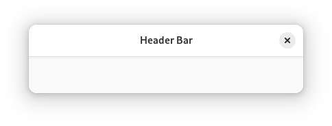
HeaderBar
Superclasses: Widget, InitiallyUnowned, Object
Implemented Interfaces: Accessible, Buildable, ConstraintTarget
A title bar widget.
AdwHeaderBar is similar to HeaderBar, but provides additional
features compared to it. Refer to GtkHeaderBar for details. It is typically
used as a top bar within ToolbarView.
Dialog Integration
When placed inside an Dialog, AdwHeaderBar will display the dialog
title intead of window title. It will also adjust the decoration layout to
ensure it always has a close button and nothing else. Set
show_start_title_buttons and
show_end_title_buttons to FALSE to remove it if it’s
unwanted.
Split View Integration
When placed inside AdwNavigationSplitView or AdwOverlaySplitView,
AdwHeaderBar will automatically hide the title buttons other than at the
edges of the window.
Centering Policy
centering_policy allows to enforce strict centering of
the title widget. This can be useful for entries inside Clamp.
CSS nodes
headerbar
╰── windowhandle
    ╰── box
        ├── widget
        │   ╰── box.start
        │       ├── windowcontrols.start
        │       ├── widget
        │       │   ╰── [button.back]
        │       ╰── [other children]
        ├── widget
        │   ╰── [Title Widget]
        ╰── widget
            ╰── box.end
                ├── [other children]
                ╰── windowcontrols.end
AdwHeaderBar’s CSS node is called headerbar. It contains a windowhandle
subnode, which contains a box subnode, which contains three widget
subnodes at the start, center and end of the header bar. The start and end
subnotes contain a box subnode with the .start and .end style classes
respectively, and the center node contains a node that represents the title.
Each of the boxes contains a windowcontrols subnode, see
WindowControls for details, as well as other children.
When show_back_button is TRUE, the start box also
contains a node with the name widget that contains a node with the name
button and .back style class.
Accessibility
AdwHeaderBar uses the GTK_ACCESSIBLE_ROLE_GROUP role.
Constructors
Methods
- class HeaderBar
- get_centering_policy() CenteringPolicy
Gets the policy for aligning the center widget.
- pack_end(child: Widget) None
Adds
childtoself, packed with reference to the end ofself.- Parameters:
child – the widget to be added to
self
- pack_start(child: Widget) None
Adds
childtoself, packed with reference to the start of theself.- Parameters:
child – the widget to be added to
self
- remove(child: Widget) None
Removes a child from
self.The child must have been added with
pack_start,pack_endortitle_widget.- Parameters:
child – the child to remove
- set_centering_policy(centering_policy: CenteringPolicy) None
Sets the policy for aligning the center widget.
- Parameters:
centering_policy – the centering policy
- set_decoration_layout(layout: str | None = None) None
Sets the decoration layout for
self.If this property is not set, the
gtk_decoration_layoutsetting is used.The format of the string is button names, separated by commas. A colon separates the buttons that should appear at the start from those at the end. Recognized button names are minimize, maximize, close and icon (the window icon).
For example, “icon:minimize,maximize,close” specifies an icon at the start, and minimize, maximize and close buttons at the end.
- Parameters:
layout – a decoration layout
- set_show_back_button(show_back_button: bool) None
Sets whether
selfcan show the back button.The back button will never be shown unless the header bar is placed inside an
NavigationView. Usually, there is no reason to set it toFALSE.Added in version 1.4.
- Parameters:
show_back_button – whether to show the back button
- set_show_end_title_buttons(setting: bool) None
Sets whether to show title buttons at the end of
self.See
show_start_title_buttonsfor the other side.Which buttons are actually shown and where is determined by the
decoration_layoutproperty, and by the state of the window (e.g. a close button will not be shown if the window can’t be closed).- Parameters:
setting –
TRUEto show standard title buttons
- set_show_start_title_buttons(setting: bool) None
Sets whether to show title buttons at the start of
self.See
show_end_title_buttonsfor the other side.Which buttons are actually shown and where is determined by the
decoration_layoutproperty, and by the state of the window (e.g. a close button will not be shown if the window can’t be closed).- Parameters:
setting –
TRUEto show standard title buttons
- set_show_title(show_title: bool) None
Sets whether the title widget should be shown.
Added in version 1.4.
- Parameters:
show_title – whether the title widget is visible
- set_title_widget(title_widget: Widget | None = None) None
Sets the title widget for
self.When set to
NULL, the header bar will display the title of the window it is contained in.To use a different title, use
WindowTitle:<object class="AdwHeaderBar"> <property name="title-widget"> <object class="AdwWindowTitle"> <property name="title" translatable="yes">Title</property> </object> </property> </object>
- Parameters:
title_widget – a widget to use for a title
Properties
- class HeaderBar
- props.centering_policy: CenteringPolicy
The policy for aligning the center widget.
- props.decoration_layout: str
The decoration layout for buttons.
If this property is not set, the
gtk_decoration_layoutsetting is used.The format of the string is button names, separated by commas. A colon separates the buttons that should appear at the start from those at the end. Recognized button names are minimize, maximize, close and icon (the window icon).
For example, “icon:minimize,maximize,close” specifies an icon at the start, and minimize, maximize and close buttons at the end.
- props.show_back_button: bool
Whether the header bar can show the back button.
The back button will never be shown unless the header bar is placed inside an
NavigationView. Usually, there is no reason to set this toFALSE.Added in version 1.4.
- props.show_end_title_buttons: bool
Whether to show title buttons at the end of the header bar.
See
show_start_title_buttonsfor the other side.Which buttons are actually shown and where is determined by the
decoration_layoutproperty, and by the state of the window (e.g. a close button will not be shown if the window can’t be closed).
- props.show_start_title_buttons: bool
Whether to show title buttons at the start of the header bar.
See
show_end_title_buttonsfor the other side.Which buttons are actually shown and where is determined by the
decoration_layoutproperty, and by the state of the window (e.g. a close button will not be shown if the window can’t be closed).
- props.title_widget: Widget
The title widget to display.
When set to
NULL, the header bar will display the title of the window it is contained in.To use a different title, use
WindowTitle:<object class="AdwHeaderBar"> <property name="title-widget"> <object class="AdwWindowTitle"> <property name="title" translatable="yes">Title</property> </object> </property> </object>