MessageDialog
Added in version 1.2.
- class MessageDialog(*args, **kwargs)
Superclasses: Window, Widget, InitiallyUnowned, Object
Implemented Interfaces: Accessible, Buildable, ConstraintTarget, Native, Root, ShortcutManager
A dialog presenting a message or a question.
Message dialogs have a heading, a body, an optional child widget, and one or multiple responses, each presented as a button.
Each response has a unique string ID, and a button label. Additionally, each response can be enabled or disabled, and can have a suggested or destructive appearance.
When one of the responses is activated, or the dialog is closed, the
response signal will be emitted. This signal is
detailed, and the detail, as well as the response parameter will be set to
the ID of the activated response, or to the value of the
close_response property if the dialog had been
closed without activating any of the responses.
Response buttons can be presented horizontally or vertically depending on available space.
When a response is activated, AdwMessageDialog is closed automatically.
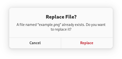
An example of using a message dialog:
GtkWidget *dialog;

dialog = adw_message_dialog_new (parent, _("Replace File?"), NULL);

adw_message_dialog_format_body (ADW_MESSAGE_DIALOG (dialog),
                                _("A file named “``%s``” already exists. Do you want to replace it?"),
                                filename);

adw_message_dialog_add_responses (ADW_MESSAGE_DIALOG (dialog),
                                  "cancel",  _("_Cancel"),
                                  "replace", _("_Replace"),
                                  NULL);

adw_message_dialog_set_response_appearance (ADW_MESSAGE_DIALOG (dialog), "replace", ADW_RESPONSE_DESTRUCTIVE);

adw_message_dialog_set_default_response (ADW_MESSAGE_DIALOG (dialog), "cancel");
adw_message_dialog_set_close_response (ADW_MESSAGE_DIALOG (dialog), "cancel");

g_signal_connect (dialog, "response", G_CALLBACK (response_cb), self);

gtk_window_present (GTK_WINDOW (dialog));
Async API
AdwMessageDialog can also be used via the choose
method. This API follows the GIO async pattern, and the result can be
obtained by calling choose_finish, for example:
static void
dialog_cb (AdwMessageDialog *dialog,
           GAsyncResult     *result,
           MyWindow         *self)
{
  const char *response = adw_message_dialog_choose_finish (dialog, result);

  // ...
}

static void
show_dialog (MyWindow *self)
{
  GtkWidget *dialog;

  dialog = adw_message_dialog_new (GTK_WINDOW (self), _("Replace File?"), NULL);

  adw_message_dialog_format_body (ADW_MESSAGE_DIALOG (dialog),
                                  _("A file named “``%s``” already exists. Do you want to replace it?"),
                                  filename);

  adw_message_dialog_add_responses (ADW_MESSAGE_DIALOG (dialog),
                                    "cancel",  _("_Cancel"),
                                    "replace", _("_Replace"),
                                    NULL);

  adw_message_dialog_set_response_appearance (ADW_MESSAGE_DIALOG (dialog), "replace", ADW_RESPONSE_DESTRUCTIVE);

  adw_message_dialog_set_default_response (ADW_MESSAGE_DIALOG (dialog), "cancel");
  adw_message_dialog_set_close_response (ADW_MESSAGE_DIALOG (dialog), "cancel");

  adw_message_dialog_choose (ADW_MESSAGE_DIALOG (dialog), NULL, (GAsyncReadyCallback) dialog_cb, self);
}
AdwMessageDialog as GtkBuildable
AdwMessageDialog supports adding responses in UI definitions by via the
<responses> element that may contain multiple <response> elements, each
respresenting a response.
Each of the <response> elements must have the id attribute specifying the
response ID. The contents of the element are used as the response label.
Response labels can be translated with the usual translatable, context
and comments attributes.
The <response> elements can also have enabled and/or appearance
attributes. See set_response_enabled and
set_response_appearance for details.
Example of an AdwMessageDialog UI definition:
<object class="AdwMessageDialog" id="dialog">
  <property name="heading" translatable="yes">Save Changes?</property>
  <property name="body" translatable="yes">Open documents contain unsaved changes. Changes which are not saved will be permanently lost.</property>
  <property name="default-response">save</property>
  <property name="close-response">cancel</property>
  <signal name="response" handler="response_cb"/>
  <responses>
    <response id="cancel" translatable="yes">_Cancel</response>
    <response id="discard" translatable="yes" appearance="destructive">_Discard</response>
    <response id="save" translatable="yes" appearance="suggested" enabled="false">_Save</response>
  </responses>
</object>
Accessibility
AdwMessageDialog uses the GTK_ACCESSIBLE_ROLE_DIALOG role.
Constructors
- class MessageDialog
- classmethod new(parent: Window | None = None, heading: str | None = None, body: str | None = None) Widget
Creates a new
AdwMessageDialog.headingandbodycan be set toNULL. This can be useful if they need to be formatted or use markup. In that case, set them toNULLand callformat_bodyor similar methods afterwards:GtkWidget *dialog; dialog = adw_message_dialog_new (parent, _("Replace File?"), NULL); adw_message_dialog_format_body (ADW_MESSAGE_DIALOG (dialog), _("A file named “``%s``” already exists. Do you want to replace it?"), filename);
Added in version 1.2.
- Parameters:
parent – transient parent
heading – the heading
body – the body text
Methods
- class MessageDialog
- add_response(id: str, label: str) None
Adds a response with
idandlabeltoself.Responses are represented as buttons in the dialog.
Response ID must be unique. It will be used in
responseto tell which response had been activated, as well as to inspect and modify the response later.An embedded underline in
labelindicates a mnemonic.set_response_labelcan be used to change the response label after it had been added.set_response_enabledandset_response_appearancecan be used to customize the responses further.Added in version 1.2.
- Parameters:
id – the response ID
label – the response label
- choose(cancellable: Cancellable | None = None, callback: Callable[[...], None] | None = None, *user_data: Any) None
This function shows
selfto the user.The
callbackwill be called when the alert is dismissed. It should callchoose_finishto obtain the result.Added in version 1.3.
- Parameters:
cancellable – a
GCancellableto cancel the operationcallback – a callback to call when the operation is complete
user_data – data to pass to
callback
- choose_finish(result: AsyncResult) str
Finishes the
choosecall and returns the response ID.Added in version 1.3.
- Parameters:
result – a
GAsyncResult
- get_body_use_markup() bool
Gets whether the body text of
selfincludes Pango markup.Added in version 1.2.
- get_default_response() str | None
Gets the ID of the default response of
self.Added in version 1.2.
- get_heading_use_markup() bool
Gets whether the heading of
selfincludes Pango markup.Added in version 1.2.
- get_response_appearance(response: str) ResponseAppearance
Gets the appearance of
response.See
set_response_appearance.Added in version 1.2.
- Parameters:
response – a response ID
- get_response_enabled(response: str) bool
Gets whether
responseis enabled.See
set_response_enabled.Added in version 1.2.
- Parameters:
response – a response ID
- get_response_label(response: str) str
Gets the label of
response.See
set_response_label.Added in version 1.2.
- Parameters:
response – a response ID
- has_response(response: str) bool
Gets whether
selfhas a response with the IDresponse.Added in version 1.2.
- Parameters:
response – response ID
- remove_response(id: str) None
Removes a response from
self.Added in version 1.5.
- Parameters:
id – the response ID
- response(response: str) None
Emits the
responsesignal with the given response ID.Used to indicate that the user has responded to the dialog in some way.
Added in version 1.2.
- Parameters:
response – response ID
- set_body(body: str) None
Sets the body text of
self.Added in version 1.2.
- Parameters:
body – the body of
self
- set_body_use_markup(use_markup: bool) None
Sets whether the body text of
selfincludes Pango markup.See
parse_markup.Added in version 1.2.
- Parameters:
use_markup – whether to use markup for body text
- set_close_response(response: str) None
Sets the ID of the close response of
self.It will be passed to
responseif the window is closed by pressing Escape or with a system action.It doesn’t have to correspond to any of the responses in the dialog.
The default close response is
close.Added in version 1.2.
- Parameters:
response – the close response ID
- set_default_response(response: str | None = None) None
Sets the ID of the default response of
self.If set, pressing Enter will activate the corresponding button.
If set to
NULLor to a non-existent response ID, pressing Enter will do nothing.Added in version 1.2.
- Parameters:
response – the default response ID
- set_extra_child(child: Widget | None = None) None
Sets the child widget of
self.The child widget is displayed below the heading and body.
Added in version 1.2.
- Parameters:
child – the child widget
- set_heading(heading: str | None = None) None
Sets the heading of
self.Added in version 1.2.
- Parameters:
heading – the heading of
self
- set_heading_use_markup(use_markup: bool) None
Sets whether the heading of
selfincludes Pango markup.See
parse_markup.Added in version 1.2.
- Parameters:
use_markup – whether to use markup for heading
- set_response_appearance(response: str, appearance: ResponseAppearance) None
Sets the appearance for
response.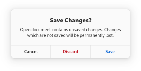
Use
ADW_RESPONSE_SUGGESTEDto mark important responses such as the affirmative action, like the Save button in the example.Use
ADW_RESPONSE_DESTRUCTIVEto draw attention to the potentially damaging consequences of usingresponse. This appearance acts as a warning to the user. The Discard button in the example is using this appearance.The default appearance is
ADW_RESPONSE_DEFAULT.Negative responses like Cancel or Close should use the default appearance.
Added in version 1.2.
- Parameters:
response – a response ID
appearance – appearance for
response
- set_response_enabled(response: str, enabled: bool) None
Sets whether
responseis enabled.If
responseis not enabled, the corresponding button will havesensitiveset toFALSEand it can’t be activated as a default response.responsecan still be used asclose_responsewhile it’s not enabled.Responses are enabled by default.
Added in version 1.2.
- Parameters:
response – a response ID
enabled – whether to enable
response
Properties
- class MessageDialog
-
- props.body_use_markup: bool
Whether the body text includes Pango markup.
See
parse_markup.Added in version 1.2.
- props.close_response: str
The ID of the close response.
It will be passed to
responseif the window is closed by pressing Escape or with a system action.It doesn’t have to correspond to any of the responses in the dialog.
The default close response is
close.Added in version 1.2.
- props.default_response: str
The response ID of the default response.
If set, pressing Enter will activate the corresponding button.
If set to
NULLor a non-existent response ID, pressing Enter will do nothing.Added in version 1.2.
- props.extra_child: Widget
The child widget.
Displayed below the heading and body.
Added in version 1.2.
- props.heading_use_markup: bool
Whether the heading includes Pango markup.
See
parse_markup.Added in version 1.2.
Signals
- class MessageDialog.signals
- response(response: str) None
This signal is emitted when the dialog is closed.
responsewill be set to the response ID of the button that had been activated.if the dialog was closed by pressing Escape or with a system action,
responsewill be set to the value ofclose_response.Added in version 1.2.
- Parameters:
response – the response ID
Virtual Methods
Fields
- class MessageDialog
- parent_instance