Button
Superclasses: Widget, InitiallyUnowned, Object
Subclasses: LinkButton, LockButton, ToggleButton
Implemented Interfaces: Accessible, Actionable, Buildable, ConstraintTarget
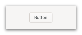
The GtkButton widget is generally used to trigger a callback function that is
called when the button is pressed.

The GtkButton widget can hold any valid child widget. That is, it can hold
almost any other standard GtkWidget. The most commonly used child is the
GtkLabel.
CSS nodes
GtkButton has a single CSS node with name button. The node will get the
style classes .image-button or .text-button, if the content is just an
image or label, respectively. It may also receive the .flat style class.
When activating a button via the keyboard, the button will temporarily
gain the .keyboard-activating style class.
Other style classes that are commonly used with GtkButton include
.suggested-action and .destructive-action. In special cases, buttons
can be made round by adding the .circular style class.
Button-like widgets like ToggleButton, MenuButton,
VolumeButton, LockButton, ColorButton
or FontButton use style classes such as .toggle, .popup, .scale,
.lock, .color on the button node to differentiate themselves from a plain
GtkButton.
Accessibility
GtkButton uses the BUTTON role.
Constructors
- class Button
- classmethod new() → Widget
Creates a new
GtkButtonwidget.To add a child widget to the button, use
set_child.
- classmethod new_from_icon_name(icon_name: str) → Widget
Creates a new button containing an icon from the current icon theme.
If the icon name isn’t known, a “broken image” icon will be displayed instead. If the current icon theme is changed, the icon will be updated appropriately.
- Parameters:
icon_name – an icon name
- classmethod new_with_label(label: str) → Widget
Creates a
GtkButtonwidget with aGtkLabelchild.- Parameters:
label – The text you want the
GtkLabelto hold
- classmethod new_with_mnemonic(label: str) → Widget
Creates a new
GtkButtoncontaining a label.If characters in
labelare preceded by an underscore, they are underlined. If you need a literal underscore character in a label, use “__” (two underscores). The first underlined character represents a keyboard accelerator called a mnemonic. Pressing Alt and that key activates the button.- Parameters:
label – The text of the button, with an underscore in front of the mnemonic character
Methods
- class Button
- get_can_shrink() → bool
Retrieves whether the button can be smaller than the natural size of its contents.
Added in version 4.12.
- get_icon_name() → str | None
Returns the icon name of the button.
If the icon name has not been set with
set_icon_namethe return value will beNone. This will be the case if you create an empty button withnewto use as a container.
- get_label() → str | None
Fetches the text from the label of the button.
If the label text has not been set with
set_labelthe return value will beNone. This will be the case if you create an empty button withnewto use as a container.
- get_use_underline() → bool
gets whether underlines are interpreted as mnemonics.
See
set_use_underline.
- set_can_shrink(can_shrink: bool) → None
Sets whether the button size can be smaller than the natural size of its contents.
For text buttons, setting
can_shrinkto true will ellipsize the label.For icons and custom children, this function has no effect.
Added in version 4.12.
- Parameters:
can_shrink – whether the button can shrink
- set_child(child: Widget | None = None) → None
Sets the child widget of
button.Note that by using this API, you take full responsibility for setting up the proper accessibility label and description information for
button. Most likely, you’ll either set the accessibility label or description forbuttonexplicitly, or you’ll set a labelled-by or described-by relations fromchildtobutton.- Parameters:
child – the child widget
- set_has_frame(has_frame: bool) → None
Sets the style of the button.
Buttons can have a flat appearance or have a frame drawn around them.
- Parameters:
has_frame – whether the button should have a visible frame
- set_icon_name(icon_name: str) → None
Adds a
GtkImagewith the given icon name as a child.If
buttonalready contains a child widget, that child widget will be removed and replaced with the image.- Parameters:
icon_name – An icon name
- set_label(label: str) → None
Sets the text of the label of the button to
label.This will also clear any previously set labels.
- Parameters:
label – a string
- set_use_underline(use_underline: bool) → None
Sets whether to use underlines as mnemonics.
If true, an underline in the text of the button label indicates the next character should be used for the mnemonic accelerator key.
- Parameters:
use_underline –
Trueif underlines in the text indicate mnemonics
Properties
- class Button
- props.can_shrink: bool
Whether the size of the button can be made smaller than the natural size of its contents.
For text buttons, setting this property will allow ellipsizing the label.
If the contents of a button are an icon or a custom widget, setting this property has no effect.
Added in version 4.12.
Signals
Virtual Methods
Fields
- class Button
- parent_instance