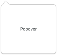
Popover
Superclasses: Widget, InitiallyUnowned, Object
Subclasses: EmojiChooser, PopoverMenu
Implemented Interfaces: Accessible, Buildable, ConstraintTarget, Native, ShortcutManager
GtkPopover is a bubble-like context popup.

It is primarily meant to provide context-dependent information
or options. Popovers are attached to a parent widget. By default,
they point to the whole widget area, although this behavior can be
changed with set_pointing_to.
The position of a popover relative to the widget it is attached to
can also be changed with set_position
By default, GtkPopover performs a grab, in order to ensure input
events get redirected to it while it is shown, and also so the popover
is dismissed in the expected situations (clicks outside the popover,
or the Escape key being pressed). If no such modal behavior is desired
on a popover, set_autohide may be called on it to
tweak its behavior.
CSS nodes
popover.background[.menu]
├── arrow
╰── contents
    ╰── <child>
GtkPopover has a main node with name popover, an arrow with name arrow,
and another node for the content named contents. The popover node always
gets the .background style class. It also gets the .menu style class
if the popover is menu-like, e.g. is a PopoverMenu.
Particular uses of GtkPopover, such as touch selection popups or
magnifiers in GtkEntry or GtkTextView get style classes like
.touch-selection or .magnifier to differentiate from plain popovers.
When styling a popover directly, the popover node should usually
not have any background. The visible part of the popover can have
a shadow. To specify it in CSS, set the box-shadow of the contents node.
Note that, in order to accomplish appropriate arrow visuals, GtkPopover
uses custom drawing for the arrow node. This makes it possible for the
arrow to change its shape dynamically, but it also limits the possibilities
of styling it using CSS. In particular, the arrow gets drawn over the
content node’s border and shadow, so they look like one shape, which
means that the border width of the content node and the arrow node should
be the same. The arrow also does not support any border shape other than
solid, no border-radius, only one border width (border-bottom-width is
used) and no box-shadow.
Constructors
Methods
- class Popover
- get_autohide() bool
Returns whether the popover is modal.
See
set_autohidefor the implications of this.
- get_has_arrow() bool
Gets whether this popover is showing an arrow pointing at the widget that it is relative to.
- get_offset() tuple[int, int]
Gets the offset previous set with
set_offset().
- get_pointing_to() tuple[bool, Rectangle]
Gets the rectangle that the popover points to.
If a rectangle to point to has been set, this function will return
Trueand fill inrectwith such rectangle, otherwise it will returnFalseand fill inrectwith the parent widget coordinates.
- get_position() PositionType
Returns the preferred position of
popover.
- popdown() None
Pops
popoverdown.This may have the side-effect of closing a parent popover as well. See
cascade_popdown.
- present() None
Allocate a size for the
GtkPopover.This function needs to be called in size-allocate by widgets who have a
GtkPopoveras child. When using a layout manager, this is happening automatically.To make a popover appear on screen, use
popup.
- set_autohide(autohide: bool) None
Sets whether
popoveris modal.A modal popover will grab the keyboard focus on it when being displayed. Focus will wrap around within the popover. Clicking outside the popover area or pressing Esc will dismiss the popover.
Called this function on an already showing popup with a new autohide value different from the current one, will cause the popup to be hidden.
- Parameters:
autohide –
Trueto dismiss the popover on outside clicks
- set_cascade_popdown(cascade_popdown: bool) None
If
cascade_popdownisTrue, the popover will be closed when a child modal popover is closed.If
False,popoverwill stay visible.- Parameters:
cascade_popdown –
Trueif the popover should follow a child closing
- set_child(child: Widget | None = None) None
Sets the child widget of
popover.- Parameters:
child – the child widget
- set_default_widget(widget: Widget | None = None) None
Sets the default widget of a
GtkPopover.The default widget is the widget that’s activated when the user presses Enter in a dialog (for example). This function sets or unsets the default widget for a
GtkPopover.- Parameters:
widget – a child widget of
popoverto set as the default, orNoneto unset the default widget for the popover
- set_has_arrow(has_arrow: bool) None
Sets whether this popover should draw an arrow pointing at the widget it is relative to.
- Parameters:
has_arrow –
Trueto draw an arrow
- set_mnemonics_visible(mnemonics_visible: bool) None
Sets whether mnemonics should be visible.
- Parameters:
mnemonics_visible – the new value
- set_offset(x_offset: int, y_offset: int) None
Sets the offset to use when calculating the position of the popover.
These values are used when preparing the
PopupLayoutfor positioning the popover.- Parameters:
x_offset – the x offset to adjust the position by
y_offset – the y offset to adjust the position by
- set_pointing_to(rect: Rectangle | None = None) None
Sets the rectangle that
popoverpoints to.This is in the coordinate space of the
popoverparent.- Parameters:
rect – rectangle to point to
- set_position(position: PositionType) None
Sets the preferred position for
popoverto appear.If the
popoveris currently visible, it will be immediately updated.This preference will be respected where possible, although on lack of space (eg. if close to the window edges), the
GtkPopovermay choose to appear on the opposite side.- Parameters:
position – preferred popover position
Properties
- class Popover
-
- props.cascade_popdown: bool
Whether the popover pops down after a child popover.
This is used to implement the expected behavior of submenus.
- props.position: PositionType
How to place the popover, relative to its parent.
Signals
- class Popover.signals
- activate_default() None
Emitted whend the user activates the default widget.
This is a keybinding signal.
Virtual Methods
Fields
- class Popover
- parent