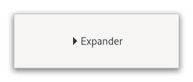
Expander
Superclasses: Widget, InitiallyUnowned, Object
Implemented Interfaces: Accessible, Buildable, ConstraintTarget
GtkExpander allows the user to reveal its child by clicking
on an expander triangle.

This is similar to the triangles used in a GtkTreeView.
Normally you use an expander as you would use a frame; you create
the child widget and use set_child to add it
to the expander. When the expander is toggled, it will take care of
showing and hiding the child automatically.
Special Usage
There are situations in which you may prefer to show and hide the
expanded widget yourself, such as when you want to actually create
the widget at expansion time. In this case, create a GtkExpander
but do not add a child to it. The expander widget has an
expanded property which can be used to
monitor its expansion state. You should watch this property with
a signal connection as follows:
static void
expander_callback (GObject    *object,
                   GParamSpec *param_spec,
                   gpointer    user_data)
{
  GtkExpander *expander;

  expander = GTK_EXPANDER (object);

  if (gtk_expander_get_expanded (expander))
    {
      // Show or create widgets
    }
  else
    {
      // Hide or destroy widgets
    }
}

static void
create_expander (void)
{
  GtkWidget *expander = gtk_expander_new_with_mnemonic ("_More Options");
  g_signal_connect (expander, "notify::expanded",
                    G_CALLBACK (expander_callback), NULL);

  // ...
}
GtkExpander as GtkBuildable
The GtkExpander implementation of the GtkBuildable interface supports
placing a child in the label position by specifying “label” as the
“type” attribute of a <child> element. A normal content child can be
specified without specifying a <child> type attribute.
An example of a UI definition fragment with GtkExpander:
<object class="GtkExpander">
  <child type="label">
    <object class="GtkLabel" id="expander-label"/>
  </child>
  <child>
    <object class="GtkEntry" id="expander-content"/>
  </child>
</object>
CSS nodes
expander-widget
╰── box
    ├── title
    │   ├── expander
    │   ╰── <label widget>
    ╰── <child>
GtkExpander has a main node expander-widget, and subnode box containing
the title and child widget. The box subnode title contains node expander,
i.e. the expand/collapse arrow; then the label widget if any. The arrow of an
expander that is showing its child gets the :checked pseudoclass set on it.
Accessibility
GtkExpander uses the BUTTON role.
Constructors
- class Expander
- classmethod new(label: str | None = None) Widget
Creates a new expander using
labelas the text of the label.- Parameters:
label – the text of the label
- classmethod new_with_mnemonic(label: str | None = None) Widget
Creates a new expander using
labelas the text of the label.If characters in
labelare preceded by an underscore, they are underlined. If you need a literal underscore character in a label, use “__” (two underscores). The first underlined character represents a keyboard accelerator called a mnemonic.Pressing Alt and that key activates the button.
- Parameters:
label – the text of the label with an underscore in front of the mnemonic character
Methods
- class Expander
-
- get_expanded() bool
Queries a
GtkExpanderand returns its current state.Returns
Trueif the child widget is revealed.
- get_label() str | None
Fetches the text from a label widget.
This is including any embedded underlines indicating mnemonics and Pango markup, as set by
set_label. If the label text has not been set the return value will beNone. This will be the case if you create an empty button withnew()to use as a container.
- get_resize_toplevel() bool
Returns whether the expander will resize the toplevel widget containing the expander upon resizing and collapsing.
- set_child(child: Widget | None = None) None
Sets the child widget of
expander.- Parameters:
child – the child widget
- set_expanded(expanded: bool) None
Sets the state of the expander.
Set to
True, if you want the child widget to be revealed, andFalseif you want the child widget to be hidden.- Parameters:
expanded – whether the child widget is revealed
- set_label(label: str | None = None) None
Sets the text of the label of the expander to
label.This will also clear any previously set labels.
- Parameters:
label – a string
- set_label_widget(label_widget: Widget | None = None) None
Set the label widget for the expander.
This is the widget that will appear embedded alongside the expander arrow.
- Parameters:
label_widget – the new label widget
- set_resize_toplevel(resize_toplevel: bool) None
Sets whether the expander will resize the toplevel widget containing the expander upon resizing and collapsing.
- Parameters:
resize_toplevel – whether to resize the toplevel